Thursday 13 December 2012

Seduced by Art: photography past and present - The National Gallery Study visit


I attended the OCA study day at the National Gallery last week. The show was, "Seduced by Art: Photography, Past and Present." The aim of the exhibition was to show how the tradition and culture of painting has affected the development of a photographic aesthetic in photography since its invention in 1839. The day began with a lecture that really helped to put the exhibition into context and allowed for discussion on some of the work that we were to see exhibited later in the day.

Eugene Delacroix, "Death of Sardanapulas."

Historical works of art were hung side by side with photography to illustrate the flow of ideas and in one of the examples a Delacroix painting, "Death of Sardanapulas," was hung with the work of contemporary photographers, Jeff Wall and Sarah Jones. Both of them have used the Delacroix painting as their reference point. In the case of Jeff Wall, it is his, "The Destroyed Room," and for Sarah Jones, her work, "The Drawing Studio (I)." It was an eye opener to be made aware of these connections. I would never have worked it out alone. For one, I am not familiar enough with traditional Western art painting. I've not seen the Delacroix painting before and the tale of the impending destruction about to happen to the king and his harem was not an obvious one for me. Also the content of the painting and the two photographs are vastly different but I could see the connection once I spent enough time analysing the works.

How many of us have been brought up with a deep knowledge of classical history, myths and painting though? I can see how Post Modernism evolved and gained a foothold now. Our own experiences in a modern society through television, film and the media, seem much more relevant to me. I'm not dismissing the referencing of art in photography. I still enjoy it. I'm just making an acknowledgement that more work is required to understand it.

Saturday 8 December 2012

Tony Ray-Jones

Another photographer that my tutor suggested for my final assignment was Tony Ray-Jones. He was British and had worked for a number of years in the USA. When he returned to the UK he brought back with him a new dynamism in photography that had spread amongst his contemporaries there.

Tony Ray-Jones take on the British at the seaside is a quirky piece of work filled with characters and surreal compositions. The dated clothes and headgear worn by many of the people also add a comic element to some of the images. Ray-Jones's work could be considered a forerunner of later works by Martin Parr that show the British off their guard in a place where the accepted societal norms are relaxed.

The images are all in Black and White and are mostly high contrast giving them depth. He is a photographer I had not come across before and I'm glad that I did.


Wednesday 5 December 2012

Mark Power - The Shipping Forecast

For my final assignment I had a look at Mark Power's, The Shipping Forecast. The black and white images taken mostly around the coastal areas of Britain seeks to photograph people and their environment in relation to the strange sounding names from the BBC Radio shipping forecast. These ethereal sounding names read out over the airwaves conjure up magical places to the ears of most listeners. Powers has attempted to put images to these words.

Quite a few of his compositions are often on the diagonal with sometimes madly tilted horizons. This gives a dynamism to his work especially when people are involved. This is a technique that I do not use enough and looking back at my own work it can look staid after viewing images such as these. When I see it in other photographers work I have to remind myself to experiment more.

The images are also mostly dark in tonal range - almost low key. I think a fair bit of processing has been done to dodge and burn highlights and lowlights - in some images the sky is almost black. The areas highlighted certainly do justice to the compositions. Again, I need to remind myself that processing an image with a particular tonal range in mind that is quite different from what has been captured can bring it to life.

There is also a gentle humour in many of the images that is in contrast to the dark tones. I found this book very interesting to look through and food for thought.

Saturday 1 December 2012

Martin Parr - The Last Resort

Martin Parr's, The Last Resort is an amazing insight into a place and people enjoying their leisure time in the coastal town of New Brighton during 1985/86. The first few images are a gentle lead-in with a smartly dressed old couple waiting for their meal in a tired but respectable looking cafe that looks as if it hasn't changed since the 40s. Then, an image of a seafront shelter with a pane of broken glass - hinting at the usual decline that can be seen in British seaside towns. But as I began to turn the pages the full on grossness of holiday makers trying to enjoy their day, surrounded by discarded chip packets and overflowing waste bins, is a bit of a shock. I found it difficult not to be repulsed - at first.

The images are full of saturated primary colours. This means that anything plastic or commercially produced, such as colourful wrappers, bathing costumes, lipstick, seems to stand out from the page. The amount of litter is extreme. The images of children or people with their feet in water that has a floating scum of garbage are revolting but fascinating. In his introduction to the book, Gerry Badger states that, "all the children in the images appear happy". I didn't see this myself. Some of them are crying and they and most of the other people in bathing costumes look like uncooked meat that is about to get a roasting from a relentless sun. I'm sure flash photography of some sort has enhanced this effect. The mass of exposed skin in many of the images to me looks designed to be unflattering. The images portray a marked amount of consumption of crisps, cans of coke, chocolate and chips. Is this intentional? Are we supposed to be appalled at the constant chewing and chomping? I guess the answer would be that the photographer is just recording what he sees. Of course, by now, we all know the falseness of this statement.

Once over the shock though, and after a read of the foreword by Gerry Badger, I can see beyond the awfulness to notice that the people are making the best of the situation that they find themselves in. It is not their fault that the rubbish bins are over flowing with refuse. They just haven't been emptied frequently enough for the amount of visitors that day. It has been stated in the introduction that the book is more a comment about the growth of mass consumerism under the Thatcher years than a criticism of a people that are forced to live in that society. It's true. The people in the images didn't make that society - they just had to live in it. A fake dream of a better life, consisting of cheap goods sold to us by advertisers working for big corporations - wanting us to consume to excess for their profit. A society that we are all now too familiar with.

Monday 26 November 2012

Assignment 5

I had to e-mail my tutor with some ideas for this one. I'd already started a photography projects book mid-course and have filled quite a few pages with random thoughts - some are much longer term and hopefully I will be able to carry them on to use in the level 2 courses. I pulled together a couple of notes from the book and also two new ideas and sent an e-mail to my tutor. One of them, a kind of typological portrait project, he said was intriguing but would need some thought on how to deal with the technical issues. He also liked a much broader idea I had to do a project based on the regeneration of the Margate seaside resort in Kent - that is the one I'm going with.

I was asked to look at the following books and my review can be found here:

Mark Power - The Shipping Forecast

Martin Parr - The Last Resort

Tony Ray-Jones

I've made some rough sketches to pre-visualise some of the kinds of image I want to make and to help me keep on track and get the most out of my first visit. I've also left enough wriggle room in the day's shooting to allow for plenty of spontaneity too. The plan is to come back from the first shoot and process and analyse what I have. Then, I can look at my book notes and see what I am missing and go back once or twice more to complete my project. Here are a couple of pages from my rough notes. I really can't draw for toffee and haven't even tried to make them realistic. The sketches are just visual reminders:


I've now made my first visit and I am quite pleased with my initial set of images. The shooting plan served me well as a visual reminder of what I wanted to achieve and as I suspected there are gaps in the shooting sequence that I need to fill. I updated my notes with more visual ideas based on what I had seen during my first day's shoot and I will be making a second visit to Margate once the rain and wind hold off.

Okay, my assignment is now complete and posted off. I had a few bumps along the way. I'd convinced myself halfway through that I had all the images I needed for my sequence - even though I hadn't taken any of the portraits that I'd planned. Because I knew that approaching strangers on the seafront at Margate would be uncomfortable I told myself to go with what I had. That was a big mistake. When the prints came back from the online lab I'd had time to clear my head and I knew that the sequence needed lifting with the missing portraits. So, I went back out and once I'd got going the task wasn't nearly as bad as I'd imagined it to be. I also took a small digital recording device with me to record peoples memories and anecdotes about Margate. I have transcribed these and printed selected excerpts to go with some of the images.

Anyway, here are my final images in sequence:


Tutor Feedback:

My tutor felt that this assignment was a good end to the course for me and he particularly liked image 10 - noting that I had used the visual language of Alec Soth to make it. This is true. I was heavily influenced by Soth's book, Sleeping by the Mississippi, when I undertook this assignment. He also felt that my portraits were well considered and suggested studying August Sander and Emil Otto Hoppe with regards to further reading on the genre. It was also noted that the Soth methodology (to include portraits in a sequence of images to help enrich the narrative) was used effectively in my sequence. He thought the last three photographs were particularly strong and a good exit to the sequence.


Tuesday 20 November 2012

Jason Evans

My tutor asked me to take a look at the work of photographer Jason Evans. My first impression of the images on his website is that they are vibrant and have a spontaneity to them that reminds me very much of Wolfgang Tillman's work. I like the freshness of the images and feel that my own work could do with a good injection of the same sense of now that comes across in Evans photography. He has a multidisciplinary approach and has done work for fashion, art magazines, album covers, and has also had a number of exhibitions. I'm still absorbing the images at the moment and like Wolfgang Tillmans the style of photography is very different from the kind of work that I'm used to. It does interest me even if I don't fully understand a lot of it. I've noticed a recurring motif of images that appear to be shot through with bullet holes. I need to think about that one.

A link to his website is here - Jason Evans

He also posts an image a day which I will make a point of taking a frequent look - The Daily Nice

Tuesday 23 October 2012

Assignment 4


I took the images for this assignment while on holiday in Chicago. The "travel" brief didn't appeal to me that much to be honest. But, after the positive response from my tutor on the previous one, I now feel more confident about stretching the assignment brief. I wanted to make a selection of interior hotel room images depicting our visit mixed in with the more travel oriented ones to shake it up a bit.

My tutor recommended three photo-books to look at and they were all really interesting and I feel that I learnt something new in terms of composition, layout, themes, style from all three. I have reviewed them here:


The way I read the assignment brief was that I was to provide approximately twelve useable images to my tutor and from them choose my final six. I assume this would be so that my tutor could see how my editing and sequencing abilities were coming along. I'm still not entirely sure that is what is required but it's all written up and posted off now so no point worrying about it.

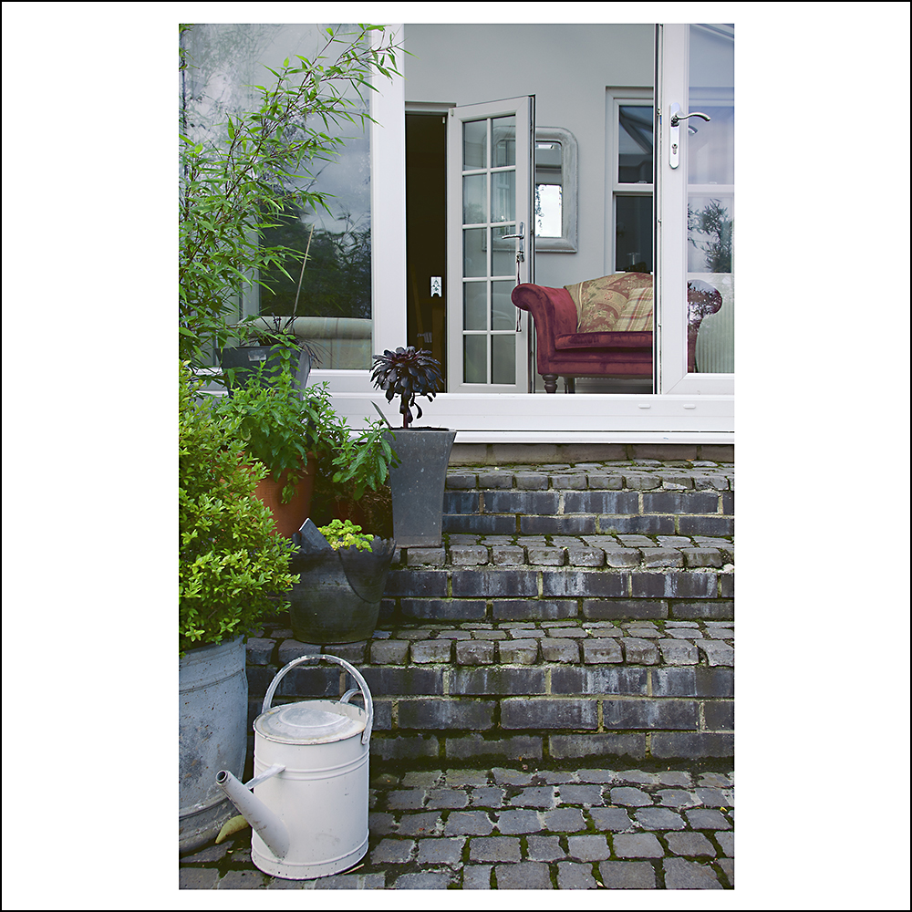
Here are my twelve images.  


Tutor Feedback:

My tutor liked the work that I did for this assignment. His feedback was on the whole positive with some improvements that could be made. The major points being that the work that I am now producing is moving me towards another level in my photography. This is good advice to hear as level two study is fast approaching!

I also need to continue with my pre-visualisation of my images in the planning stages. This is a method that works well for me as going into a situation with some idea of the kind of shots that I want to achieve can provide me with some strong images to select from.

He really liked a number of my images. Only one fell a bit short of the standard that I set myself. I had already noted this in my assignment notes and explained why the image didn't quite pull off what I had intended. I will probably remove it from the set and present a new one for assessment.

From an academic standpoint my tutor noted that, "I am also impressed with the way in which you are now referencing the texts suggested and positioning your work in relation to these practitioners." This aspect of analysing my work and placing it in context of other photographers is something that I can do in my head; but, actually putting these thoughts into words in an academic manner I find the most difficult - something I definitely need to keep working on.


Edit:

For my submission I have replaced some of the images.

Image 4 was a nice idea but as I mentioned in the essay it didn't come out the way I had intended it. The image has now been replaced with this one.


Image 5 was a linking image from 4 and now that has been removed this is to go also. I have replaced it with this one.


I'm not entirely happy with the composition of image 10 so it has been replaced with this one.


Saturday 20 October 2012

Project 23 - selective processing and prominence

Here's an image I took in Chicago of people interacting with Anish Kapoor's "Cloudgate" sculpture. There are plenty of people watching and candid shots to be taken here as the subjects are so engrossed and just about everyone has their camera out too.

In this image the foreground figure is a little dark and blends into the image too much.


As well as increasing the overall exposure without burning out the sky I have selectively increased the brightness of the foreground figure to make him much more prominent. I did this with the selection tool and created a new levels layer. I then used a mask and went around the edges of the selection to soften it.


Monday 15 October 2012

Rineke Dijkstra - The Art Institute of Chicago

On my recent trip to America I spent some time in the Art Institute of Chicago. The Institute has a wide ranging collection of contemporary painting, photography, sculpture and installation pieces. I was particularly taken with the work of photographer Rineke Dijkstra. I have read about her work in photography blogs and it was good to see many of her portraits together full size and in one large gallery space. The larger format work certainly helps the viewer to appreciate the detail that has been recorded using large format cameras. I have read that the ungainly poses of the young subjects taken at the beach mimic a 19th century method of portraiture - mainly that the slow shutter speeds used at that time required the sitter to be frozen, sometimes using clamps and head rests to achieve an unblurred image. Djikstras has taken this idea of an uncomfortable and frozen position and used it in her beach portraits. This is in an attempt to stop the sitter from projecting a false pose that we all tend to use whenever a camera is present. The photographer in her attempt to capture a true likeness is using this method to expose a hidden truth in the sitter. Djikstra's other work has involved subjects at a moment of heightened emotion such as matadors shortly after leaving a bullring.

I also spent some time inside the gallery practising my people shots for the course work. The hovering gallery attendants were particularly useful in this respect. In this Djikstra image I managed to get an interesting reflection as the attendant with his arms held to his side seems to be almost mirroring the awkward pose of the young woman.


The uncluttered gallery space is a good place to practise with balance between people and simple objects.

The people also are generally absorbed in the work they are viewing and can take up interesting and unconscious positions.


The hands on the hip thing is quite popular...


Thursday 11 October 2012

The British Landscape - John Davies

The British Landscape by John Davies
ISBN 095468947X

The landscapes in this book are beautifully photographed in black & white. It is also quite large and the detail can really be appreciated. The composition of the images are quite graphical and feature mainly towns and semi rural spaces. The choice to shoot in black and white has been made to provide a harmony to scenes that could be quite discordant.

This book has a contemplative feel to it. The accompanying text provides insight into what has happened to the landscape before and after the images were taken. For instance power stations have been decommissioned and knocked down. This gives a sense of change to the images. The large scale of some of the buildings make them look like permanent fixtures in the landscape and the text makes the viewer ponder the nature of the ever changing British landscape.

Compelling compositions are made using strong diagonals and leading lines. Height is also used to gain an elevated viewpoint and the viewer feels almost like a bird floating just above the trees.

This book is a big contrast to the other two that were recommended for my assignment 4. There are no intimate details - all the shots are wide vistas. I have a feeling I will definitely be returning to this book for my Level 2 landscape course.

Monday 8 October 2012

The Red River by Jem Southam

The Red River by Jem Southam
ISBN 0948797258

This book also uses text and poems  in a collaborative form to bring alive the images. The feeling I get is of a dank, dark, cloudy and overcast environment where everyday there is drizzle and the smell of wet leaves and oozing mud. The images were interesting because the area around the Red River is in sharp contrast to the Cornwall that I know of sunny days and rugged coastline.

The book is themed with seven sections representing interpretations of myths on creation, the primordial forest, industrialisation, post industrial leisure among others.

The way the book was put together like this was intriguing and showed me just how different an approach can be when choosing themes and narratives. The images themselves again loosely following a river like the Alec Soth book and showed us misty scenes with stone houses covered in ivy; an aviary shot close and filling the frame; an underground mining tunnel the muddy redness oozing from the walls and a hole in the ground with a discarded fridge dumped inside. The images were recognisably British and evocative of parts of our landscape.

Saturday 6 October 2012

Project 21 - Making figures anonymous


This is an image that I took when I was working on assignment 2. It wasn't suitable to use in the sequence for that set as it is so different from the rest of my people shots. I was quite pleased to catch the butcher just as he leant forward and appeared to meld with the pig's head. I liked it so much I saved it for one of these exercises and it illustrates quite well how to obscure someone's face in an image.


This was taken in Antwerp and shows how to add interest by using a figure in a shot while at the same time making them anonymous by having them facing away from the camera.


Antwerp station again. Most of these images were taken with assignment 4 in mind but then I abandoned the idea before using my Chicago trip instead. I'm starting to think I like them more! This image illustrates a figure in silhouette.


Friday 5 October 2012

Sleeping By the Mississippi - Alec Soth


Sleeping By the Mississippi
ISBN 3865217532

This book was a joy to read. It starts with a written essay by Patricia Hampl recounting a Sunday drive as a young child with her father to see the local flood damaged area by the Mississippi river in 1956. Neighbourhoods are gone and even before the first picture I could smell the rotten wood and picture bits of furniture floating down the street. "Think of the pianos!" is a wonderful line spoken by the girls mother in the text.

The images in the book lead the viewer along a meandering path close to the river - through towns, showing us people, places and things. There are many themes that can be picked out in the images -  religion being one prominent feature in many of the portraits and landscapes. But there is also a deeper subtext. We see a number of beds in use and abandoned. A grubby mattress part submerged in swampy water and surrounded by leafless winter trees. The supporting text at the end of tells us that beds and peoples dreams are a motif throughout the book. The cover image is of a grubby yellow wall with empty picture hooks where once plates and trinkets were hung. A postcard of a river flowing towards a mountain bathed in a red sunset has been left behind. An amazing image. Peoples hopes, dreams, aspirations are all set out in this one photograph.

Some of the portraits in the book were fascinating also.

Crystal, Easter, New Orleans, Missouri, is one that comes to mind. I think the reason we can read these images so well (even when they at first appear so far removed from our own lives) is because we are all part of a hyper-connected modern experience that we all share. Even if some of the glimpses we have are moderated through films, television, photography, we have far more in common with a cross dressing (trans-genderd?) person sitting on a Disney bedspread in New Orleans than an exquisite image of 19th century Paris by Atget.

Edit:

To show that my photography has developed since reading this book and to place my own work in context with other photographers I have included some images from later assignments below. These particular images can be directly attributed to the influence of analysing and reflecting on the work of Alec Soth. I made a conscious decision to highlight the mundane environment and to juxtapose it against street portraits for this assignment.


Tuesday 2 October 2012

Project 19 - A Single Figure Small


I hung around the main train station in Antwerp for these exercises to show a single figure small. I've had them written up for a while but not had a chance to post them.  The station has a lot of interesting architectural features and I chose a suitable place and then waited for a figure to appear in the correct spot to photograph them. This takes quite a bit of practice as a busy crowd can make it hard to isolate a more interesting figure. This figure is just slightly off-centre as I was too slow with my trigger finger.


There was more time to place this figure as he walked down the long ramp.


This guy taking a snooze caught my attention. I had to do some dodging and burning on this image to pick out elements of the track and platform.


Tuesday 28 August 2012

Time and old/found imagery


I've been musing on some points raised by my tutor for assignment 3. It has taken me a while to get around to posting about it as they have been intriguing and I knew I needed to do further research. This all relates to the images in the latter part of my assignment. I'd used an old photograph in the images at the site of my childhood home to help portray a sense of identity and shared history between myself and my sister. One of them can be seen below:


I'd seen a number of photographers use this approach in their work and I felt that the simple compositions in this set needed more visual clues to what I was trying to say - in this way the use of an old photograph helped to enrich the images.

My tutor comment below spelt out the process of found or old imagery and when I read it I instinctively knew that this process and the manipulation of it to form other ideas was something I want to pursue further: 

[The idea to use ‘old’ or ‘found’ imagery is not a modern concept, but has been very usefully applied by many throughout the history of the discipline. It worked very well for you here and really played a significant part, during the latter stages of the project. The process you are considering can be summarised as follows:

  1. Time elapses.
  2. Significant events occur.
  3. Specific details / people are recorded.
  4. Artifacts are created. [images]
  5. Variety of different histories are formulated [from different perspectives]
  6. These histories are recalled and embellished. [See Dawkins - Meme’s]
  7. Some histories are eventually forgotten or disappear.
  8. The ‘Artifact’ remains.
  9. Some artifacts are lost and some are collected. [The Archive]
  10. More time elapses.
  11. The archive or collection is interrogated.
  12. Histories are recalled or created.
  13. The event once more becomes significant.]
It is fascinating to read the process laid out like this and particularly the mention of alternate, embellished or created histories. I'm sure that we have all had the experience of a family story that has been told by an elderly relative and taken to be true only to turn out for it not to be the case at all. There is also the problem of mistaken identity when long forgotten family photographs are discovered and someone thinks the person might be some great aunt so and so but nobody really knows.

The image/artifact that I have created above has a particular meaning to me when I look back at it. I left this place at 13 years old, my sister having moved away to get married a number of years earlier. When we returned to the site of our former home to make the images it was the first time that we had both been back here together. Even though I was trying to direct my sister and concentrate on making my images I could see in her demeanour a profound sense of what had taken place here when we were growing up. I wasn't immune to these feelings myself and this shared moment is what I see now when I look at the image. It is a memory shared between both of us that will not necessarily translate if the artifact is to remain and be discovered and read by new viewers at a later time. Will they be able to recall the history of this artifact or will they create a new history for themselves? In fact the whole sequence of images could be read by an outside observer entirely differently already - as a journey of social mobility from poor working class origins to a more comfortable and affluent existence in the late 20th century.

These ideas helped me connect with the work of a photographer that I saw at the Taylor Wessing Portrait Prize 2011. The image,"Glamis Castle, Angus, UK," by photographer Hui Yao from the series, "Mirage," was a portrait of the photographer taken outside the castle in the snapshot aesthetic style. This was an exploration by the photographer who had grown up in China to re-create a new, alternate, boyhood experience from the perspective of the West. The image can be seen here on his website, Yaohuier.com.

I can see now that these ideas feed into the process that my tutor is describing and that there is a lot more background information behind some of the most simple of images that is at first realised. Dawkins Meme's is also a theory that I had not come across before and I was intrigued by the concept of ideas and behaviours that spread from person to person within a culture as if they were self replicating.


Wednesday 15 August 2012

The Genius of Photography

This book from the P&P reading list is a bit of a monster in size. It has good quality reproductions of the images and the colour ones are actually in colour!


The Genius of Photography: How photography has changed our lives - Gerry Badger
ISBN 978-1-84400-363-1


I've read it twice now. Once to just enjoy the subject matter and a second time to take notes. This is a bit of a time consuming thing to do and I don't do it for every book - but sometimes I get so engrossed I don't want to interrupt the flow to make notes. Also by doing a second reading I will have had time to digest the subject matter and any areas that seem a bit fuzzy to me can be re-read and re-interpreted. This was the case for the sections on Modernism. There were so many different ideas to take in under that one umbrella term. For instance, Structuralism, Formalism, how Surrealism grew out of Dadaism - a massive note taking session was required in the end.

I feel that I have a grasp of the concepts now and that when particular photographers or styles are referred to I can place them in context and not get my "isms" mixed up. I also bought the DVD version of the BBC series back when I was doing TAOP. I would say that the book covers the subject in more depth and is much more useful to photography students.

I enjoyed reading the book - although I did note the authors bias towards Straight photography came through at times. My copy came from the library but as it is only around £10 on Amazon I have added it to my (ever growing) wish list of books on photography.

Wednesday 8 August 2012

Behind the Image: research in photography - Anna Fox, Natasha Caruana

Behind the Image: research in photography

This book discusses the importance of planning when it comes to photography projects. The authors explain that keeping a workbook and the use of mind maps and lists to keep track of ideas and explore them further is fundamental to the process of photography. The book explains how ideas can be traced to their origins and expanded outwards into new areas that may not have occurred at the time of the original thought.

I did this myself for my last assignment. I found the reflective process to be very useful as problems occurred and new avenues of thought opened up that allowed me to continue and complete my project.

The importance of research is discussed highlighting the use of archives and assessment of the project against current theoretical photography practice to put a project into context. Material that has been collected along the way should also be carefully collated into a personal archive for future use by the photographer as this can also be reflected upon and at a later time lead to new awareness and projects.

I did some research into prefabs for my last assignment and found the process of obtaining books from the library and internet to be invaluable when it came to adding some depth and background to the project.

Constant re-evaluation and reflection is crucial to the success of the project and this can only be done when a written log is kept to help assess where the work has begun and where it may be going.

As well as the need to keep a workbook which of course is just a broader version of our learning logs another useful idea was to use a voice recorder or the option on most mobile phones to keep a record of fleeting ideas that come to us at odd moments.

I checked to see if my mobile had the facility and within ten minutes of stopping at a chapter to make a cup of tea I was recording some thoughts into my phone that had occurred to me. I will transfer these to my workbook in due course.

This is a very useful book that sets out how to organise the mind and keep track.


Thursday 2 August 2012

Assignment 3

My tutor suggested three books to read in preparation for this assignment. I enjoyed all three and managed to find something in each of them that can be applied to my project. My thoughts on the books can be found in my blog here:

Julian Germain - For Every Minute You Are Angry You Lose Sixty Seconds of Happiness

Wolfgang Muller - Karat: Sky Over St Petersburgh

Stephen King - Lewis's Fifth Floor: A Department Story

In short, I found that the Germain book had a strong and moving narrative. This is an element of photography that I really enjoy and would like to try and emulate in my own work. The Muller book was gritty and hard hitting. The King book had strong elements of design and composition in keeping with photographing the iconic interiors. My reflections on the books has made me aware of the different  approaches that can be used when faced with a project and that some are more suited than others.

I spent a lot of time reflecting on these different elements and felt a bit flummoxed when I came to deciding what to photograph. My tutor had suggested finding some derelict buildings and I did look at this. I also toyed with the idea of photographing the interior of closed retail units. What brought me up short in all of these ideas was the course requirement to photograph between four and five different buildings. I really wanted a strong narrative theme to link my images and I couldn't see a way of doing this that would also be possible within a two month time frame that I had set myself to complete this assignment. The retail units in particular would need time consuming access to be requested and granted. The typological approach could be used like the Bechers but that was an approach that I didn't want to explore at this particular moment.

I finally settled on a concept that is stretching the brief somewhat but does fit within the style and methodology shown in the three photobooks listed above. I wanted to follow my sister around from building to building as she leaves home, goes shopping and finally arrives at my mother's house. I am at the planning stage and have started a notebook of ideas to help me plan a shooting script. I will scan and post pages from this at a later stage. My shoot will take place over the course of one day and is planned for this Friday. Hopefully my planning will allow me to achieve everything that I need to capture for the assignment. In preparation for the shoot I will also be researching the buildings during the course of this week.


Shooting script: Don't laugh at my matchstick men drawing style. Hey, it suits my needs...


Finally, after some bumps along the way and changes to my concept that have been documented in my written assignment I've finished. My new concept involved a change of building but I think it has worked out to be a stronger idea creatively than my original. My only worry is that I may have stretched the brief a bit too far. My final building has been demolished so I'm not sure how well it will be received. This was the hardest one yet and it is posted and I await feedback. The images are listed below along with accompanying text for the sequence:


Tutor Feedback:

My tutor was very positive about this assignment. That was a huge relief as this is the first time that I have ever strayed from the brief and adapted an assignment to suit my own personal interests. This approach was commented on and commended. He also mentioned that it was the first time he had seen this particular assignment use a linking narrative to bring the images together. I was pleased that my ideas worked. I really didn't want to just photograph a different set of buildings to show their uses. On reflection I would say that my liking for the narrative element of photography really helped me here and worked in my favour - In effect it spurred me on to change the brief to suit my own creative needs.

My tutor felt that the last set of images (my former home, now demolished) was inspired. I am glad that he felt this way. I was concerned I had pushed it too far by trying to photograph a building that no longer existed. He said that these images were some of the strongest in the set and the inclusion of text helped to enrich them. The last few were quite simple images and as I mentioned at the planning stage the decision to use a richer text for these was intentional. I was given some interesting leads about the process of memory, meme theory, and how photographs are interpreted through time. I found the ideas intriguing and will follow up on my reading with a view to pursue further. [edit: I have since reflected further on my tutor comments for these particular images and my thoughts have been posted here.]

I've also experimented with layouts with assessment in mind. The accompanying text for these images was presented to my tutor on separate facing sheets between the photographs. I toyed with the idea of incorporating the text onto the same page and underneath the image (as shown above.) In practise, when printed up, the text dominates and the eye is drawn to it over and over. My personal opinion is that the simpler images need time to be absorbed and I will keep all the text on a separate facing page for assessment.